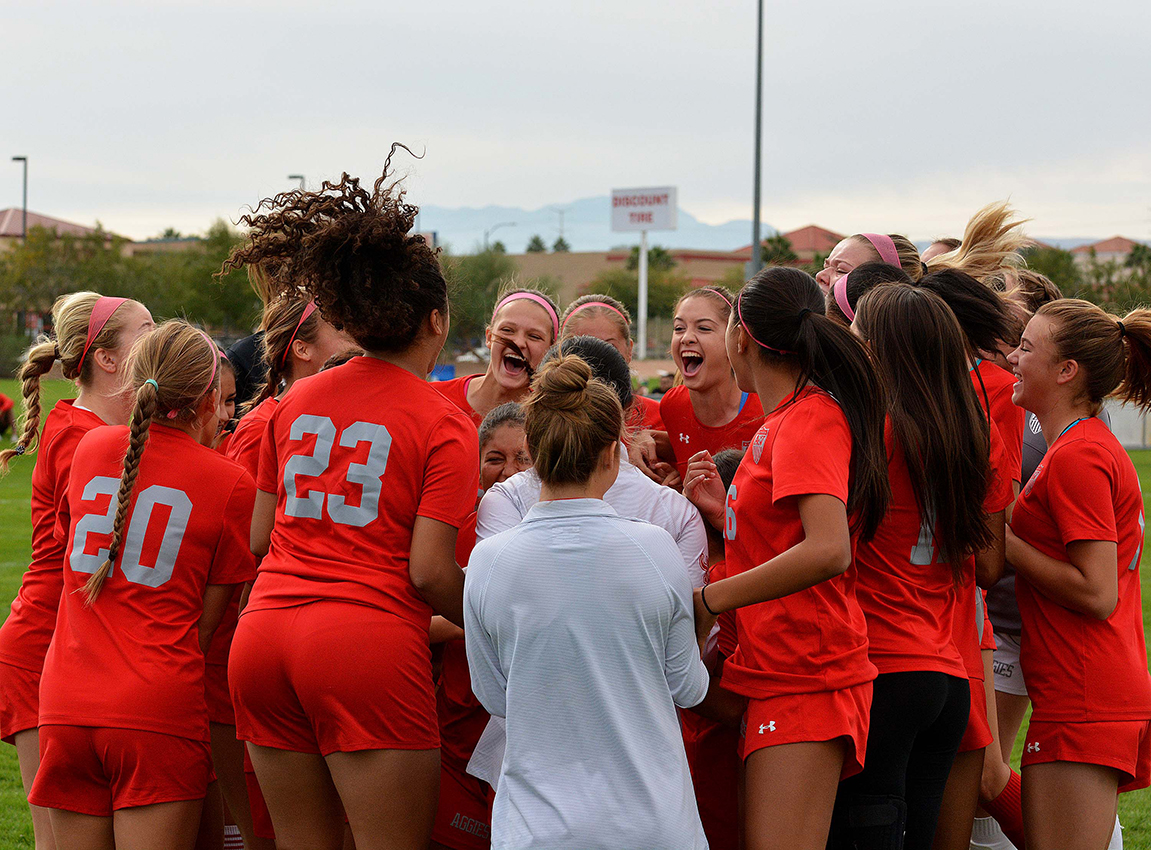

Sport as a catalyst for change
Sport as a catalyst for change HERIZON is built on the belief that sport can be a powerful driver of social change when supported by
More than a logo: the visual identity of HERIZON
More than a logo: the visual identity of HERIZON The HERIZON visual identity was designed to reflect the core values of the project: strength, safety,
Introducing HERIZON: empowering women through safe and inclusive sport
Introducing HERIZON: empowering women through safe and inclusive sport HERIZON is a European cooperation project running from 1 November 2025 to 31 October 2027, co-funded

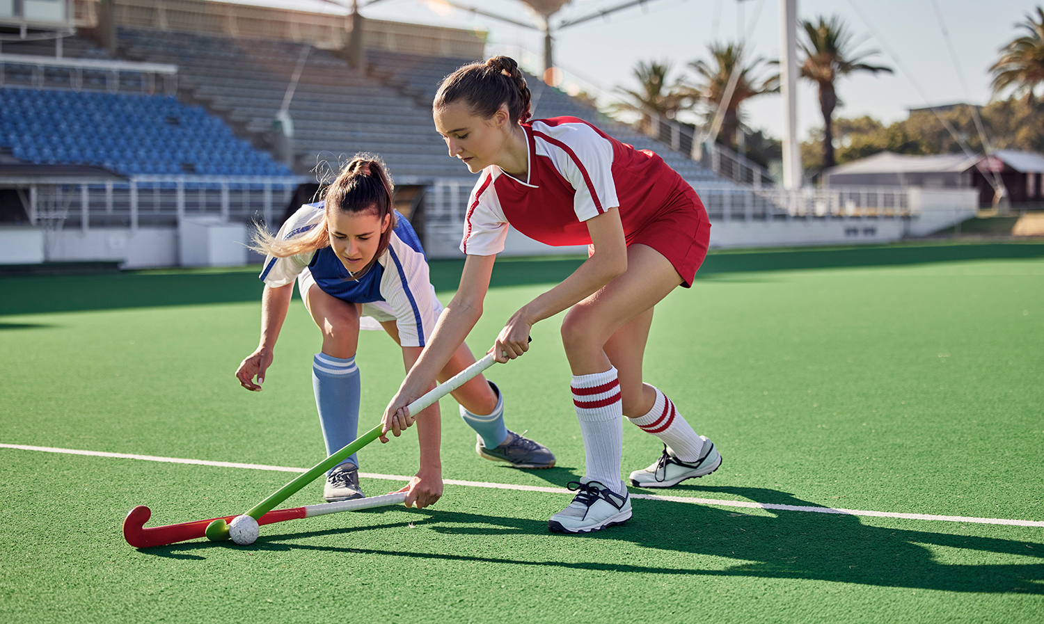
HERIZON field hockey activity in Rome – Day 2
HERIZON activity in Rome – Day 2 Just a few days after their first encounter with field hockey, students from Istituto Santa Maria in Rome

Encouraging first steps in sport: HERIZON field hockey activity in Rome
First contact with sport: HERIZON activity in Rome On 10 November, students from Istituto Santa Maria in Rome took part in a field hockey promotion